4 Data Visualisation
4.2 Quick multiplots
For a quick look at the data, it’s possible to use plot_timeseries. The user can specify which arguments to use, using measurements. There’s a choice between different combinations of "pressure", "light", "acceleration", "temperature" and "magnetic". You can add any parameters from ?plot, here I illustrate it with col="cornflowerblue" and by showing how to restrict the x-axis limits xlim with the date format, to zoom into the post breeding mihration period of a hoopoe
par(mar=c(3,4,0.5,0.5))
plot_timeseries(hoopoe, col="cornflowerblue",
                measurements = c("pressure", "light", "acceleration"),
                xlim=c(as.POSIXct("2016-08-20","%Y-%m-%d", tz="UTC"),
                       as.POSIXct("2016-09-01","%Y-%m-%d", tz="UTC")))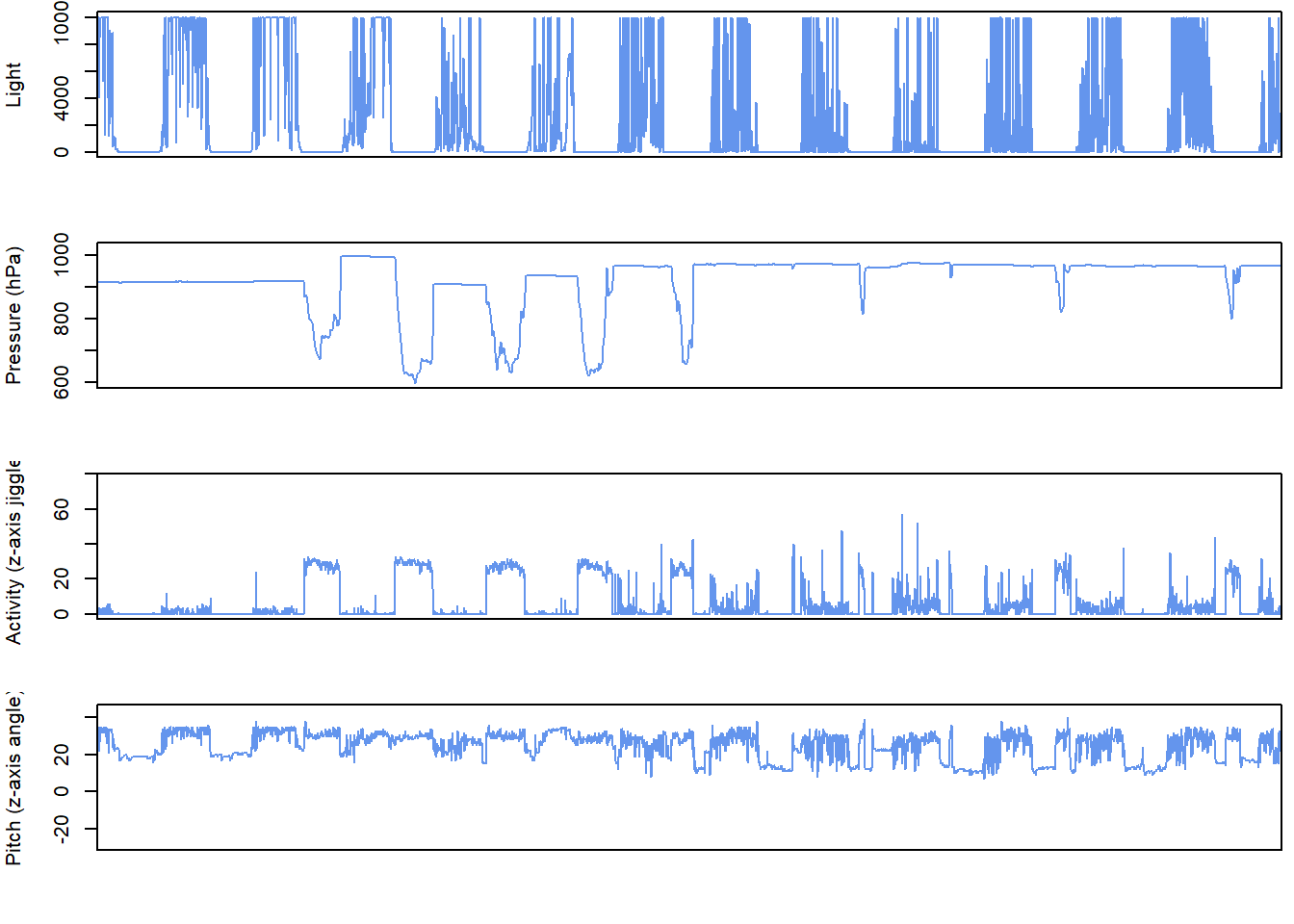
4.3 Interactive timeseries
To have a better overview of the data, it is possible to create interactive plot_interactive_timeseries() plots which allow the user to compare different measurements recorded by the logger. These might for instance include light, temperature, pressure, activity, pitch and magnetism.
If you are working from Rstudio, this bit of code should be run:
# In Rstudio, it will display in the viewer by default and use a lot of ram, and is better in html
backup_options <- options()
options(viewer=NULL) # ensure it is viewed in internet browser
plot_interactive_timeseries(dta = PAM_data) # plot
options(backup_options) # restore previous viewer settings
If you are working from base R use this instead:
To save space here we only plot only one variable - pressure .
The reason there is additional code for Rstudio, is that by default it will open this graphic in the viewer pane and use up a lot of ram. This additional code allows the user to open this window in a browser instead of r studio, and the file can later be saved as an html file.
With this interactive plot, the user can then zoom in and out of different plots to help get a feel for the data. For instance, this is a great way of seeing changes in the data which might be due to a logger being in a rucksack and no longer on the birds, or to look at how acticity or pressure might look during migration periods.
It is possible to select areas to zoom into by right clicking and highighting certain regions, and to double click to zoom out. All plots are synched to the same time period and have a timeline at the bottom to increase or decrease the time over which the data is observed.
4.4 Sensor images
Actograms are often used to plot activity over time at different hours of the day. However, the same approach can be used to plot any sensor data, not just activity. For simplicity, we name these “sensor images”. Plotting all sensors side by side is an important step for visualising data and developing an understanding of data patterns, and to start thinking about the behaviours that may be driving the observed patterns. pamlr offers a function plot_sensorimage()for plotting sensor images, which can be implemented as follows.
# Create plots with 3 together (mfrow)
par( mfrow= c(1,3), oma=c(0,2,0,6))

par(mar =  c(4,2,4,2))
plot_sensorimage(PAM_data$acceleration$date, ploty=FALSE,
                 PAM_data$acceleration$act, main = "Activity",
                 col=c("black",viridis::cividis(90)), cex=1.2, cex.main = 2)

par(mar =  c(4,2,4,2))
plot_sensorimage(PAM_data$pressure$date, plotx=TRUE, ploty=FALSE, labely=FALSE,
                 PAM_data$pressure$obs,  main="Pressure",
                 col=c("black",viridis::cividis(90)), cex=1.2, cex.main = 2)

par(mar =  c(4,2,4,2))
plot_sensorimage(PAM_data$temperature$date, labely=FALSE,
                 PAM_data$temperature$obs,  main="Temperature",
                 col=c("black",viridis::cividis(90)), cex=1.2, cex.main = 2)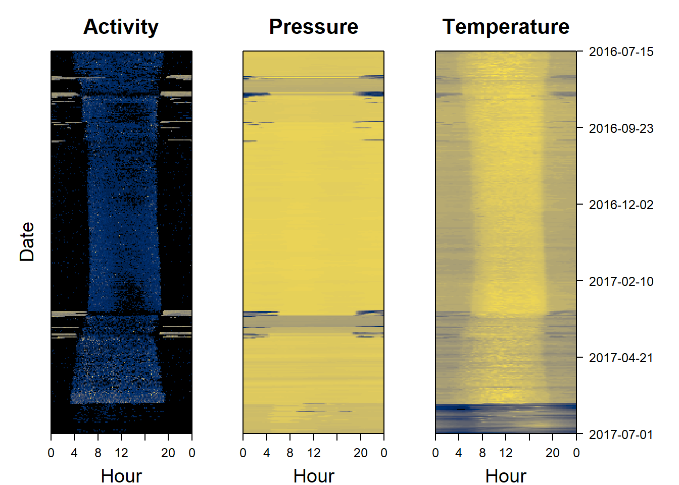
4.5 Histograms and three-dimensional scatterplots
Histograms can provide a first impression of whether some of the data may be aggregated and therefore clustered. Indeed, sensor images are not always well-suited for visualising tri-axial data, such as magnetic field or acceleration data. By plotting data in three dimensions (hereafter “3D”) using the function plot_interactive_3d it’s possible to visualise patterns or clusters of datapoints which would not otherwise be apparent in the data. Here we plot magnetic data.
4.6 Spherical projections
4.6.1 g-sphere
A g-sphere is a method of visualising tri-axial acceleration data. This involves centering the data and plotting it on a sphere.The function calculate_triaxial_acceleration allows the user to center this data (as well as calculating pitch, roll and yaw from the data)
# plot an g-phere
calibration = calculate_triaxial_acceleration(dta = PAM_data$magnetic)
plot_interactive_sphere(x = calibration$centered_accx,
                        y = calibration$centered_accy,
                        z = calibration$centered_accz,
                        ptcol = "royalblue",
                        ptsize = 0.03,
                        linecolor ="orange",
                        spherecolor="orange",
                        arrows=TRUE)
4.6.2 m-sphere
An m-sphere is a method of visualising tri-axial magnetometer data. This involves centering the data and correcting the data, before plotting it on a sphere.The function calculate_triaxial_magnetic calibrates the data. This provides the animal’s bearing.
# plot a m-phere
calibration = calculate_triaxial_magnetic(dta = PAM_data$magnetic)
plot_interactive_sphere(x = calibration$calib_magx,
                        y = calibration$calib_magy,
                        z = calibration$calib_magz,
                        ptcol = "orange",
                        ptsize = 0.03,
                        linecolor ="royalblue",
                        spherecolor="royalblue",
                        arrows=TRUE,
                        cex=2)