9 Example 1: Flapping
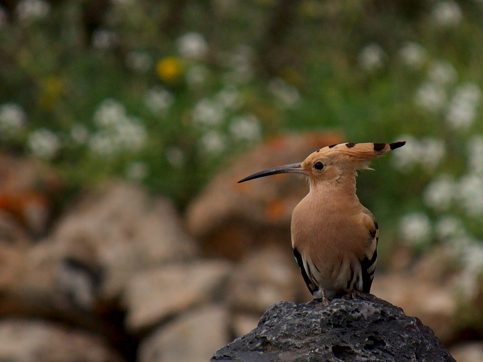
Figure 9.1: Photograph by Frank Vassen, (c) creative commons
9.1 Classifying migratory flapping flight in Hoopoes :The dataset
Hoopoes (Upupa epops) have been tracked on the their migrations from Switzerland (to sub-Saharan Africa) using SOI-GDL3pam loggers.
- Pressure is recorded every 15 minutes
- Light is recorded every 5 minutes
- Activity is recorded every 5 minutes
- Pitch is recorded every 5 minutes
- Temperature is recorded every 15 minutes
- Tri-axial acceleration is recorded every 4 hours
- Tri-axial magnetic field is recorded every 4 hours
9.2 Visualise data
Sensor images are a good place to start when analysing data, as they can give a rapid overview of the dataset. Darker colors represent lower values, and lighter colors (in this case yellow) represent higher values. Sensor images for activity (also known as an actogram), pitch, pressure and temperature are a good place to start. The following code plots this for us:
par(mfrow= c(1,4), # number of panels
    oma=c(0,2,0,6), # outer margin around all panels
    mar =  c(4,1,4,1)) # inner margin around individual fivure

plot_sensorimage(PAM_data$acceleration$date, ploty=FALSE,
          PAM_data$acceleration$act, main = "Activity",
          col=c("black",viridis::cividis(90)), cex=1.2, cex.main = 2)

plot_sensorimage(PAM_data$acceleration$date, plotx=TRUE, ploty=FALSE, labely=FALSE,
          PAM_data$acceleration$pit,  main="Pitch",
          col=c("black",viridis::cividis(90)), cex=1.2, cex.main = 2)

plot_sensorimage(PAM_data$pressure$date, plotx=TRUE, ploty=FALSE, labely=FALSE,
          PAM_data$pressure$obs,  main="Pressure",
          col=c("black",viridis::cividis(90)), cex=1.2, cex.main = 2)

plot_sensorimage(PAM_data$temperature$date, labely=FALSE,
          PAM_data$temperature$obs,  main="Temperature",
          col=c("black",viridis::cividis(90)), cex=1.2, cex.main = 2)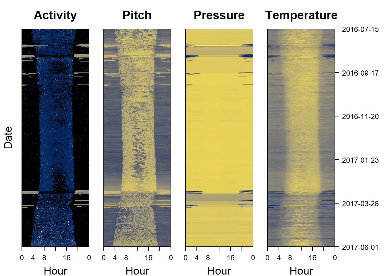
9.3 What should we look for?
Base on this plot, it is possible to see that nightime is the darker areas on the right and left sides of the plot, and daytime the “blob” in the middle. During the migratiory season (august/september and march), the nightime period is very different, with higher activity and pitch, and lower than usual temperature and pressure. These correspond to migratory flight periods.
This can also be seen by cutting out a period in september are looking at the raw data.
9.4 Performing the classification
Because flapping is widespread in birds, pamlr integrates a pre-defined function classify_flap() to classify this behaviour.
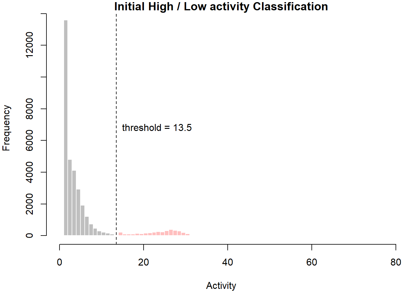
This function assumes that if the bird has displayed high activity for x number of consecutive minutes, then it is flapping. It is therefore important to think about what constitutes high activity and how long this period should be. At the moment, the function uses k-means clustering to identify the threshold between high and low activity. Using to_plot = TRUE then allows the user to see where that threshold was drawn. The period of high activity is set by default to period = 3. This is because activity is recorded (on this logger) every 5 minutes and we assume that after an hour of high activity, the bird must be flapping.
Thus “high activity duration” / “data resolution” = “period” and 60 minutes / 5 minutes = period of 12.
## List of 7
##  $ timetable     :'data.frame':  32 obs. of  3 variables:
##   ..$ start       : POSIXct[1:32], format: "2016-08-06 20:20:00" "2016-08-07 19:40:00" ...
##   ..$ end         : POSIXct[1:32], format: "2016-08-07 01:50:00" "2016-08-08 09:15:00" ...
##   ..$ Duration (h): num [1:32] 5.5 13.58 8.67 4.25 1.33 ...
##  $ classification: num [1:92449] 0 0 0 0 0 0 1 0 0 0 ...
##  $ no_movement   : num 0
##  $ low_movement  : num 1
##  $ high_movement : num 2
##  $ migration     : num 3
##  $ threshold     : num 13.5
This classification therefore provides different pieces of infomration.
- timetable shows when a migratory flapping flight started and stopped, and how long it lasted (in hours)
- classification is the output from the classification. In this case, each cluster/classs/state is represented by numbers between one 1 and 4. To find out what behaviour each of these numbers represent, we can refer to low_movement, high_movement, migration and no_movement
- threshold represents the threshold between high and low activity.
Using these information, it’s therefore possible to plot the classification:
# Plot behaviour
col=col=c("black","royalblue4","brown","gold")
index= 7300:8000
plot(PAM_data$acceleration$date[index],PAM_data$acceleration$act[index],
  type="l", xlab="Date", ylab="Activity")
points(PAM_data$acceleration$date[index],PAM_data$acceleration$act[index],
  col=col[behaviour$classification+1][index],
  pch=16,)
legend( PAM_data$acceleration$date[index[1]],60 ,
        c("No activity", "Low activity", "High activity", "Migration" ) ,
        col = col[c(behaviour$no_movement, behaviour$low_movement,
                    behaviour$high_movement, behaviour$migration)+1],
        pch=20)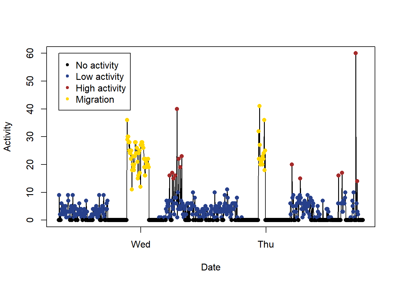
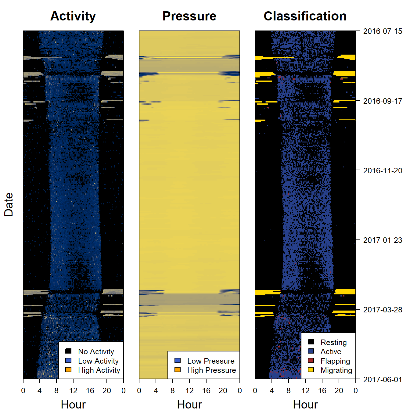
9.5 Plot the classification as a sensor image
Another way of looking at a classification is to use a sensor image of the results and to plot it side by side with the raw data to see if the same patterns are being picked out. We can also add (for instance sunset and sunrise events)
par(mfrow= c(1,3), # number of panels
    oma=c(0,2,0,6), # outer margin around all panels
    mar =  c(4,1,4,1)) # inner margin around individual fivure

plot_sensorimage(PAM_data$acceleration$date, ploty=FALSE,
          PAM_data$acceleration$act, main = "Activity",
          col=c("black",viridis::cividis(90)), cex=1.2, cex.main = 2)
legend("bottomright",cex=1.2,
   c("No Activity", "Low Activity", "High Activity" ) , fill = c("black","royalblue3", "orange"), xpd = NA)


plot_sensorimage(PAM_data$pressure$date, plotx=TRUE, ploty=FALSE, labely=FALSE,
          PAM_data$pressure$obs,  main="Pressure",
          col=c("black",viridis::cividis(90)), cex=1.2, cex.main = 2)
legend("bottomright",cex=1.2,
   c("Low Pressure", "High Pressure" ) , fill = c("royalblue3", "orange"), xpd = NA)


plot_sensorimage(PAM_data$acceleration$date, labely=FALSE,
          behaviour$classification,
          main="Classification",
          col=col,
          cex=1.2, cex.main = 2)
legend("bottomright",cex=1.2,
  # grconvertX(1, "device"), grconvertY(1, "device"),
   c("Resting", "Active", "Flapping", "Migrating" ) , fill = col, xpd = NA)